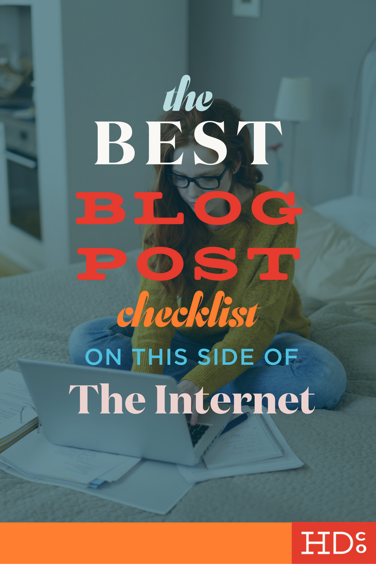
The Best Blog Post Checklist on This Side of the Internet
Have we learned some things in all our time of blogging?
HELL YES! Lots of those things are small tips here and there that can really boost the quality of your blog content. And one of those things specifically is that checklists make everything more manageable.
So when clients asked us for a guide to commonly overlooked mistakes in blogging, what did we do?
Created an awesome checklist of key points to double-check on every blog post before you hit publish, of course!
Feel free to print this handy checklist out and check off each point with an impressive red pen. Or just follow along on your screen.
And make sure to use the checklist in conjunction with this blog post, we’ll explain each point and why it's important. Ready?
Okay, here we go!
section 1: your title
1. An optimized title
Your title is one of the MOST important parts of your content. It's the first thing readers use to decide whether your article is worth their time. Is your title lame? Then your whole post is lame too, in the mind of a reader. Writing multiple titles – multiple titles! – in order to get out of the box and find the best fit is a MUST.
A good title is memorable, compelling, accurate, and concise, uses a mix of language, and ideally sparks emotion in your audience.
RESOURCE: The awesome Headline Analyzer tool from CoSchedule is a go-to for us. It rates your title in multiple categories and even gives you a preview of what your content would look like in a search. Aim for at least a 70 – this post's headline scored a 74.
2. Correct capitalization
This being the internet, you've got some leeway with your capitalization choice. But like basically anything we talk about, consistency is key. Choose your capitalization format and stick to it! We go by pretty standard rules: Capitalized first and last words (along with any word over five letters long), lowercase articles, lowercase coordinating and subordinate conjunctions, and lowercase "to" in infinitives.
RESOURCE: Have this automatic capitalization tool on hand to double-check your titles. We use the default setting with this tool!
Section 2: your body text
1. Logically organized
Does the way you've organized your post make sense? You want your post to be well-structured, with a beginning, middle, and end, and smooth transitions. Would your content be better off as a list? A set of instructions?
Make sure your organization doesn't get in the way of your content. Feeling lost or confused is a total turn-off for readers – you want to help them work through your content – not make them piece together your collection of jumbled thoughts.
2. Frequent line breaks
Reading is more tiring for our eyes on a screen. Breaking up your text using techniques like line breaks and appropriate headings will help keep your readers' eyes on your content. Four sentences without a line break is really pushing it, so I try and keep chunks of text to a maximum of three sentences.
3. Headings contain keywords
This one is important for two reasons: because headings help your reader make sense of your content more quickly and because headings can boost your search engine optimization (SEO) by telling Google and other search engines what content is most important in your text. Long story short, headings are important and you should use them wisely!
4. Appropriate links
Is your content linked appropriately? You should have links to other posts or pages on your own website and links to other websites too.
5. Totally error-free
This one should be a no-brainer: You want to avoid errors in spelling and grammar. That means going beyond simply checking for squiggly red lines.
Read over your work completely at least once, and preferably multiple times with a fresh pair of eyes. Readers judge your errors like there's no tomorrow.
RESOURCE: Grammarly is a fave! It's one of our favorite free writing resources on the internet, in fact.
Section 3: your images
1. All images appropriately sized/optimized
Sizing and optimizing all images improves your page load time and that improves your search ranking. No blog post is complete without making sure all of your images are sized and optimized! Read more about how sizing affects SEO here.
RESOURCES: We use the free, online version of Image Optimizer whenwe’re in a hurry and EZ Gif for whipping GIFs into shape. Two thumbs up on these!
2. All images appropriately titled
What?! I have to title ALL my images?
Yes. Title. All the images. All of them. Title them all. Why? Because Google likes it! Learn more about that SEO *ish here.
3. Make sure all captions are worthwhile
Double-check your captions to make sure they're helpful and relevant. Sometimes it's okay to pull a Kanye and have captions play a role in your post, but more often an image caption should describe what the image is in order to act as a stand-in for anyone who can't see the image – whether it's because their internet sux, they're using a screenreader, or some other reason.
4. Left-aligned images must be purposefully place – right-aligned images are almost always better
Readers' eyes scan in an F-shape across your content in order to grab the most text in the quickest way. Left-aligning images interrupt that reading pattern and can make readers skip whole blocks of your text. Basically, they're more often disorienting than helpful.
Make sure that ANY left-aligned images are absolutely essential and their placement plays some larger role (like we did with numbered points here, for example) or else change their alignment to right-aligned or center-aligned ASAP.
5. Attractive, pinnable graphic with title is included
This one is extremely important if you're integrating Pinterest into your blogging routine. By including a graphic with your title in every blog post, you're setting yourself up for Pinterest success. Want the numbers to back that up? Pinterest analytics ftw.
Section 4: your ending
1. Call to action is included
What is it you want a reader to do when they get to the end of your post? Tell them explicitly! That's what a call to action (CTA) is for – a call that gets your reader to do something connected to your overall business goal.
For us, it's usually a shoutout to ask for readers' responses via comments, but other times it might be a call to sign up for a mailing list, share your content, or something else.
RESOURCE: This guide is perfect for helping you get to where you need to go with that CTA.
2. Spotlight on related content is included
Referring your reader to additional content on your site is the best way to keep readers engaged. Do so at the end of each blog post, with a spotlight on related or featured content.
In Squarespace, do this by adding a summary block and specifying the parameters to include. This keeps readers on your site and offers them additional help with whatever topic they're interested in!
Section 5: final settings check
1. URL makes sense
Bigger isn't necessarily better where URLs are concerned. Your URL doesn't need to include the entire title of your post – rather, you should check that it hits on keywords in an accurate manner.
2. Featured image
Give all your articles a featured image so that you can control what will be appearing when your article is shared or appears in a summary block.
3. Check your responsive layout
Lastly, change the size of your screen before you hit publish! Make it long and narrow, like an iPhone, or long-ish and narrow-ish like a tablet, to check that all your images and content still make sense and don't get jammed together when you're viewing your article in different dimensions that your computer screen.
If images do interrupt your text before they're useful (this is the most common side effect we've found in Squarespace), fix them! Change your placement slightly to make your content work as a whole in all screen sizes.
That's ALL, guys!
We hope you can use this resource again and again in creating kickass blog posts. We would LOVE to hear your feedback and any additional points you think we should add on. And we'd love to check out your content! Let us know in the comments below or on Facebook, Twitter, Instagram, or Pinterest.
Psst... Want to make blogging even more streamlined?
Hoot Design Co. is a marketing, branding, and design agency located in Columbia, MO. We specialize in creating a custom and comprehensive marketing strategy centered around your business's unique strengths and educating you with the tools you need from day one. From logo design to brand identity, website design and execution, and social media marketing strategies in-person and through online courses, we're focused on your business success every step of the way.

