7 Important Tips That Will Improve Your Web Copy Right Now

We work with clients who have never written web copy before all the time.
And you know what? When you start out, it can be a struggle.
The rules that you learned in school largely don't apply. Neither do your guidelines for proposals, presentations, research write-ups, etc., etc., etc.
So we're here to help you out. Here are our 7 best tips to improve your online writing ASAP.
Let's dive right in.
1. Break up your paragraphs
When writing online, a big way you can help your reader out is by avoiding large blocks of text. Keep your paragraphs short – we're talking 3 to 4 sentences maximum.
Why? Your readers' eyes are getting tired.
Readers' eyes actually process information differently when they read on a screen. What might be a perfectly fine paragraph on paper is likely too long for your typical online reader. Online, readers' eyes actually start to tire when they're faced with big blocks of text.
So break it up!
2. Give your readers cues by using a visual hierarchy of text styles
Part of breaking up your text is calling out what's important using different levels of hierarchy.
[Related: This is how to finally understand elements of art]
One way to do this is to make sure your headings and subheadings give the right amount of emphasis: Heading 1 (h1) should carry the most weight – use it for page titles. Heading 2 (h2) should carry the second most weight – use it for article titles, and so on, all the way down to normal paragraph text, captions, and footnotes.
But go beyond just heading styles to call out important info.
Use bold and italics to get your point across. Consider using pull quotes or specially-styled blocks of texts – perhaps they have colored backgrounds or a different font – to pull out important snippets.
This off-colored block of text is an example of one way we call attention to some text using visual hierarchy.
Keep in mind is that what might look tacky in print (um, as in lots of bold and italics, and bold and italics together) is actually helpful online.
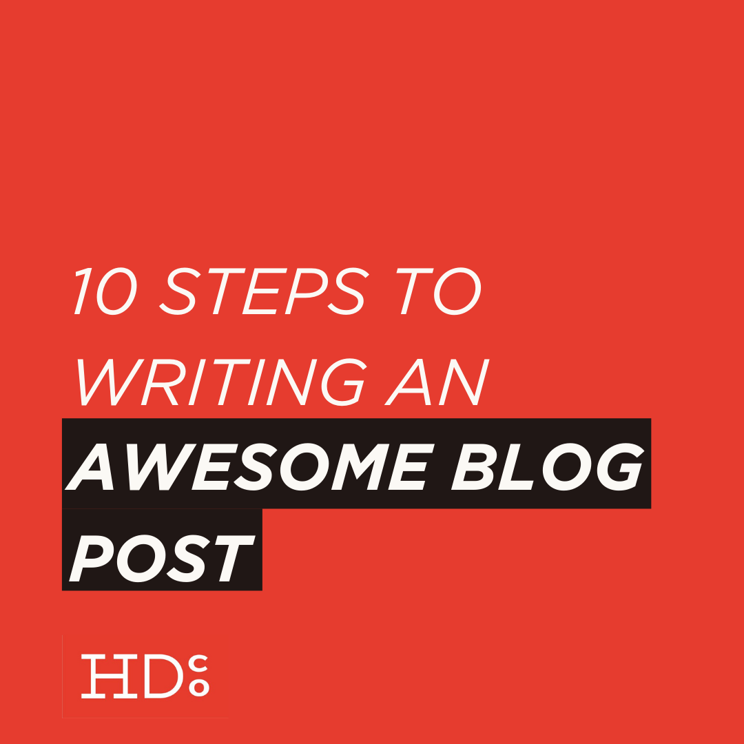
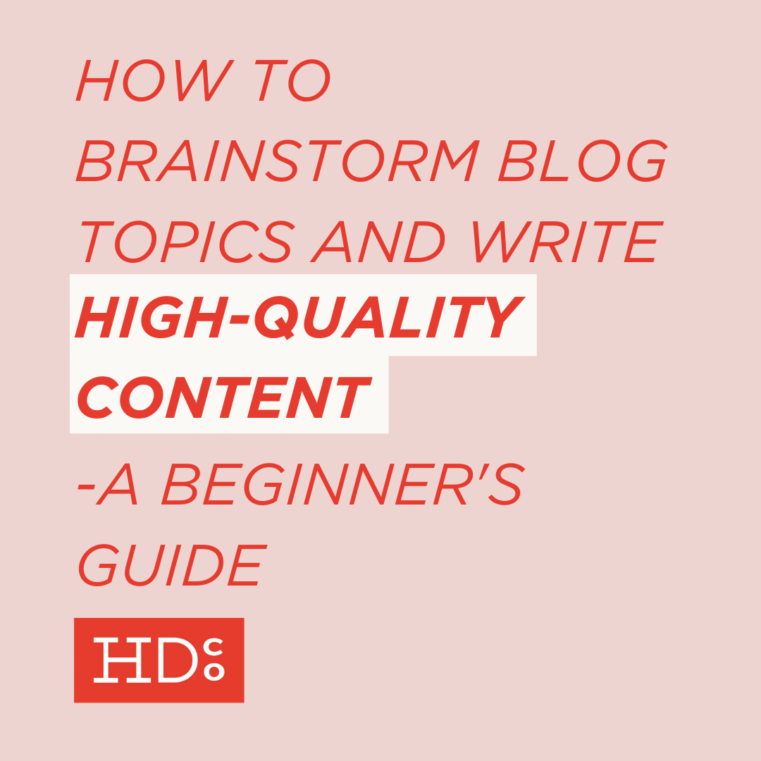
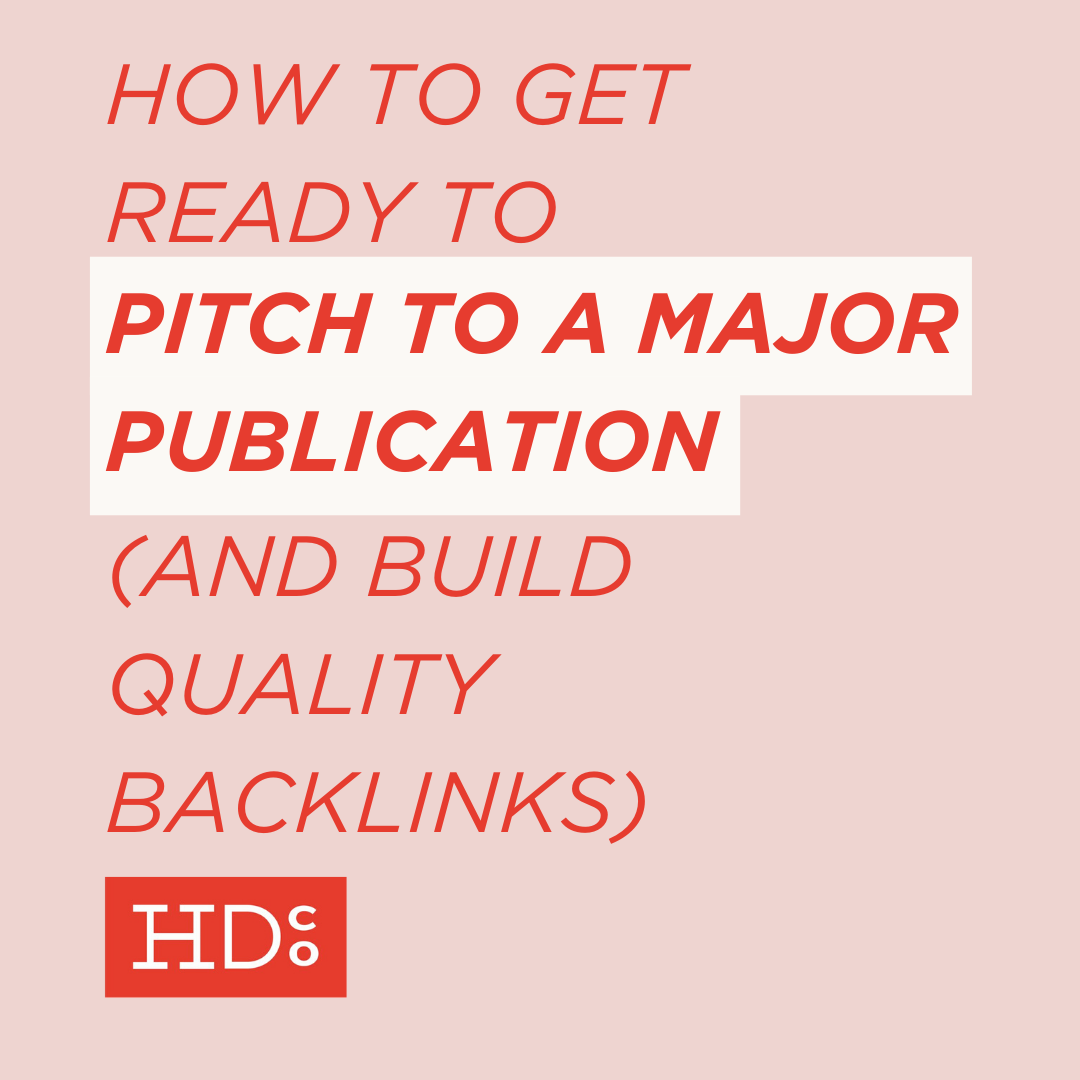
3. Add images (because they're skimming everything else)
Remember how your readers' eyes get tired? Give them a break – and keep them engaged – by including images.
Ideally, these images are custom-created photos or graphics that reinforce your point. But you can take it a step further by including graphs or charts when you're dealing with data. Or by using the holy grail of all internet imagery – gifs – but only if they're on-brand for you.
Why include images?
Readers are notorious for skimming text online.

Images: totally the bomb for web copy and blogging.
Readers' eyes move in an F-shape online. They take in the whole title, the intro, and often skim down the rest. But all of these techniques so far – breaking up paragraphs, using visual hierarchy, and including images – shake readers out of that big, long skim.
4. Mind your reading level
The type of writing readers expect online is different than the writing that's expected in more formal places. Readers online are used to shorter sentences with simpler concepts.
But all too often, people write in a stuffy, formal way online. Because that's how we were taught to write in school. As a result, sentences get way too long. Grammar gets way too complicated. And your communication ends up being way too complex.
We want to keep it simple and streamlined. Switch out long words for short ones, and break up those pesky sentences.
How? One great way to check if your copy may be too complex is to check its reading level. How easy is your text to read?
Generally, you want to aim for around a 6th grade reading level when writing for the web.
I know that sounds low, but it's what many people expect online. Keeping your reading level in check helps you keep your text approachable. And as an added benefit, slimming down your words helps you maintain clarity and get to the point.
Looking for help? We highly recommend using this handy readability tool to analyze your text. Also check out the passive voice detector on the same site.
Check out the readability breakdown of this section of this blog post.
[Related resource: The best free writing tools on the internet]
5. Avoid unnecessary jargon
Jargon sucks.
Unless you're in an extremely specialized field and speaking only to an audience of your (extremely specialized) peers, jargon is unnecessary.
So don't use it! Switch out complicated terms and acronyms for words more people understand. Goodbye, jargon.
6. Restate to reinforce
This one's pretty straightforward. If you KNOW readers are going to skim your copy, how can you make sure they take something away?
State your main point again. And then again. And again. (In different ways!)
Readers SHOULD be able to pick up your argument without it being broken up into tiny bites. That's what we expect in any more formal setting. But once again, on the interwebs, take that extra step to make sure your readers are really getting it.
If that sounds weird, try this trick: After every example you give to illustrate a point you're making, go out of your way to tie that example back to the main concept. Circle back again and again to reinforce what you're saying.
If you printed your text and read it aloud, it would probably sound pretty repetitive. But online, that simple repetition can make a big difference to your easily distracted readers.

Yep, you've got to deliver your main point. Again. And again. And again.
7. Always tie images in
This one's pretty simple: Images are great. But they always need context.
Readers don't like to be confused. So if your image doesn't fit in seamlessly, use captions! Captions help readers quickly understand the point you're illustrating. Plus, captions provide additional information for vision-impaired viewers who may be using a screen reader. Helpful stuff.
Do you have other strategies to improve your web copy?
I'd love to hear them. Leave a comment below, or reach us on Twitter @hootdesignco.


Hoot Design Co. is a marketing, branding, and design agency located in Columbia, MO. We specialize in creating a custom and comprehensive marketing strategy centered around your business's unique strengths and educating you with the tools you need from day one. From logo design to brand identity, website design and execution, and social media marketing strategies in-person and through online courses, we're focused on your business success every step of the way.