What Is Branded Interior Design?
Branding is about more than logos, and interior design goes beyond kitchen renovations. In this blog, we’re going to explain just what goes into branding and interior design, and how they can work together to improve your business. Are you ready to become an expert on branded interiors? Let’s get into it!
Branding 101
Branding is one of our favorite words to throw around. Your brand is what others say that you are. It has the power to evoke emotions from your customers, and it differentiates your products from competitors. Logos, fonts and color palettes are important aspects of your brand, but the most important element of all is consistency.
Interior Design 101
Interior design goes well beyond kitchen renovations. Interior designers work on everything from hotels to restaurants to offices. A good interior designer can create a space that reflects the overall look and feel of your business. A great interior designer can evoke emotion from anyone who walks inside. Sound familiar?
Branded Interiors
Your business has an overall look and feel. Branding and interior design can pull emotions from consumers and visitors. Consistency is important. Do you see how branding and interior design work together to create a full picture?
Your interior design should mirror your brand and further the connection consumers feel with your business. If your business’s space isn’t on-brand, your whole image falls apart. Not convinced? Let’s look at some examples of branded interiors.
Starbucks
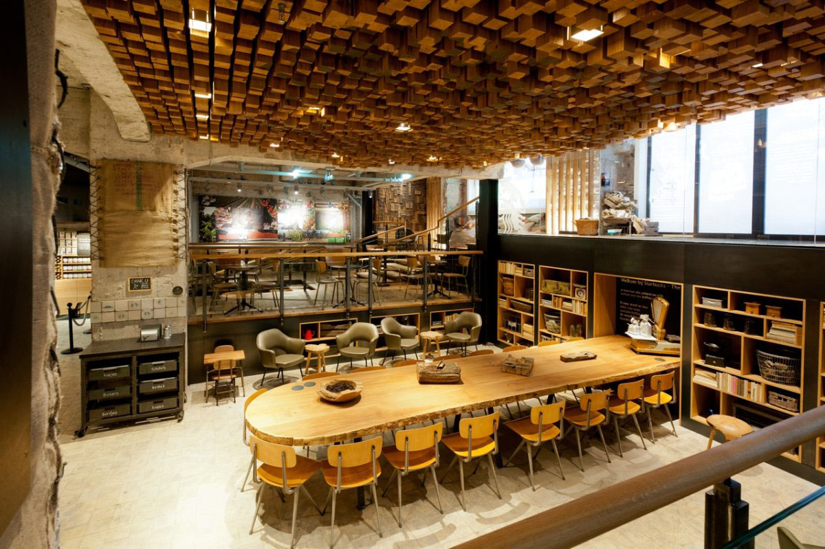
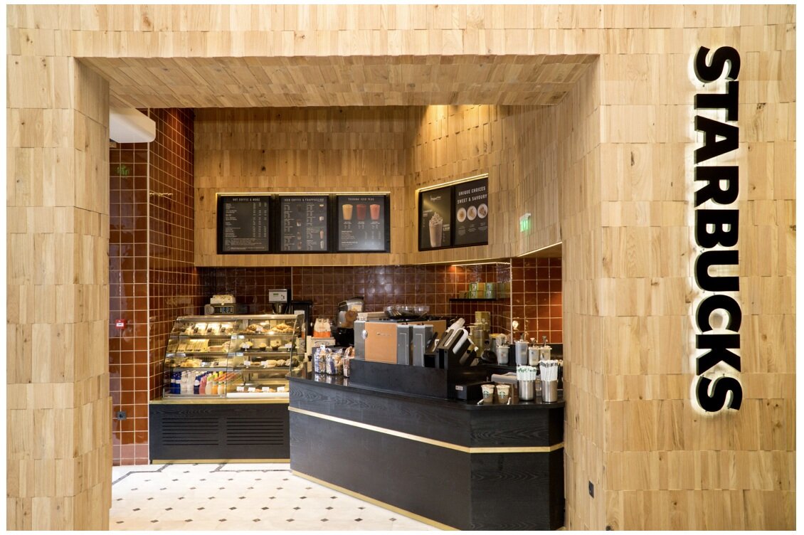
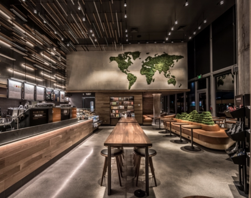
Starbucks has a distinct look and feel. NO brand gets to the Starbucks level without one. You can walk into a Starbucks anywhere in the world and know, without a shadow of a doubt, that you are in a Starbucks.
Starbucks’ interior design goes beyond slapping a logo on the wall. It uses smart design to evoke feelings from visitors and consumers. And these feelings are specific. Starbucks wants customers to feel comfortable and warm, like they can stay for awhile to sip on a coffee or crank out some work. Starbucks wants to convey a luxurious image, and make visitors feel like part of an exclusive community. And it uses luxe furnishing, comfortable seating, and dim lighting to ensure each shop evokes these feelings.
McDonald’s
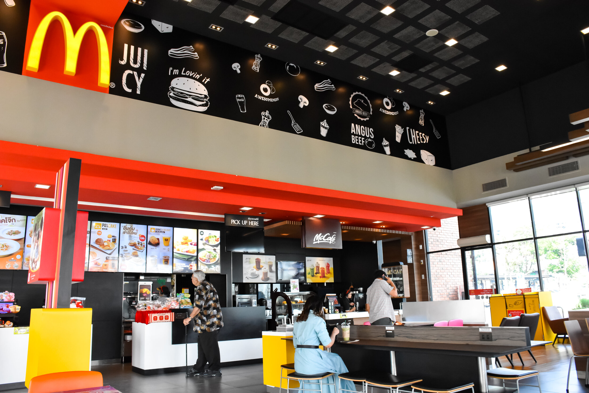
McDonald’s is another strong, global brand. Again, no company becomes as expansive as McDonald’s without a solid identity. It’s the power of the golden arches, baby.
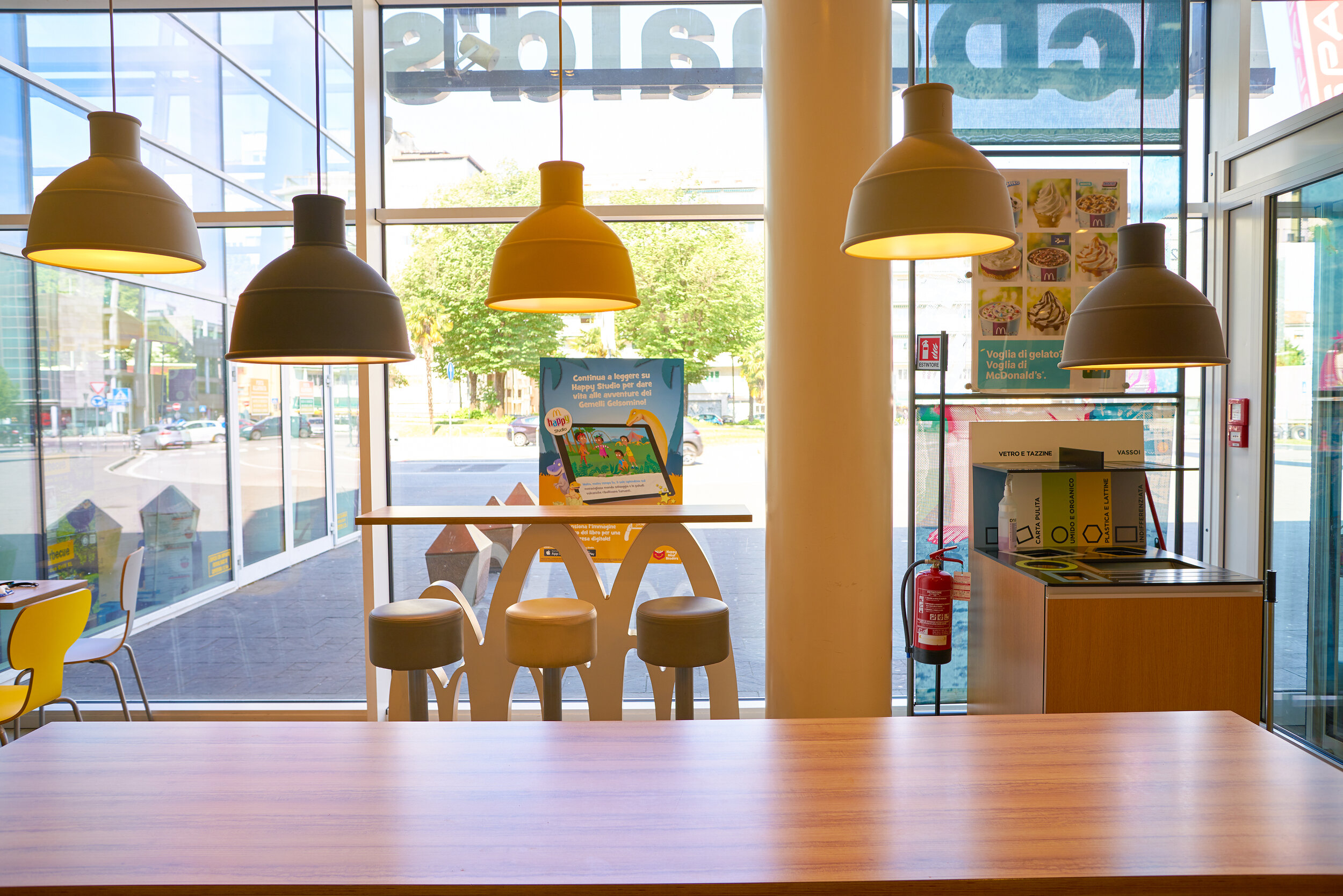
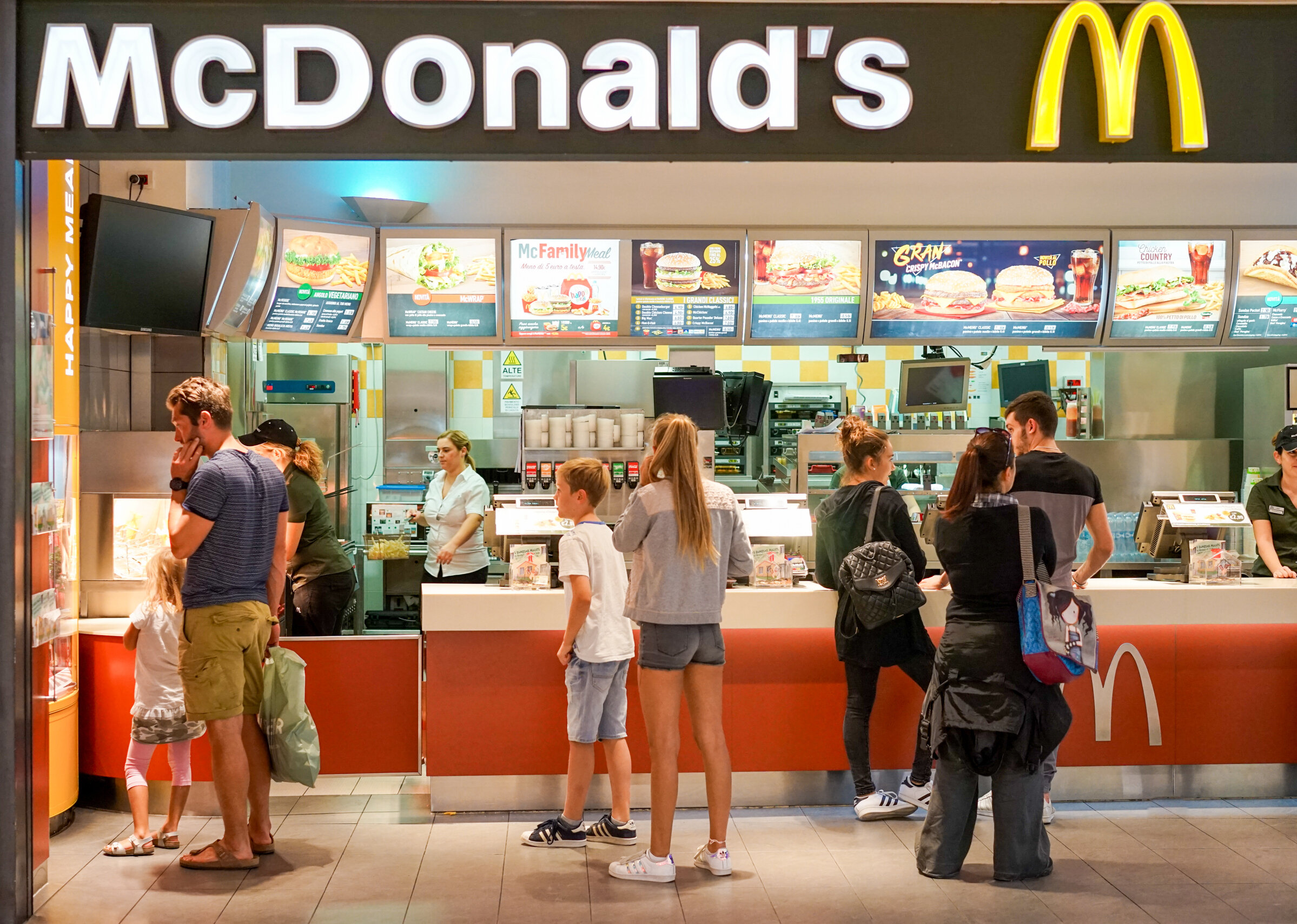
McDonald’s brand is all about being quick, convenient and family friendly. McDonald’s interior design uses bright colors that are both appealing to kids and relatively uncomfortable for adults. The company doesn’t want you to stay for hours and hours on end. That’s not part of the McDonald’s brand. These fast-food restaurants use harsh lighting and sharp edges to convey that they are accessible to all, but more focused on providing a quick service than an evening-long dining experience.
Still not convinced?
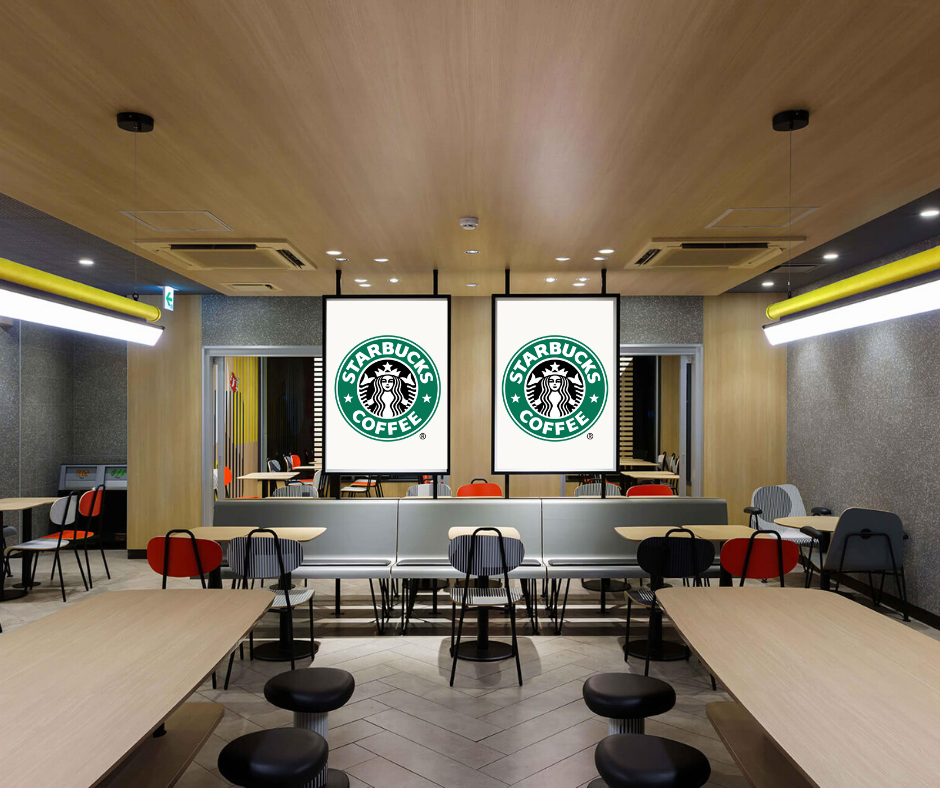
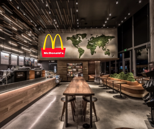
Okay, you get the difference between McDonald’s and Starbucks. But maybe you’re still not seeing the full picture here. “Why can’t you just throw your logo on the wall and call it a branded interior?” you wonder. Well, this is why.
These images are ALL WRONG. If you slap a McDonald’s logo on a Starbucks wall, it still feels like you're in a Starbucks. If you walked into a McDonald’s and saw the Starbucks logo, you’d be confused as heck because you would still feel like you’re in a McDonald’s.
Interior design and branding are all about evoking emotions from customers. That’s why, when done right, branded interiors build trust with your customers and elevate your business. But when you take shortcuts, like chucking your logo on a wall and calling it a day, it creates confusion and cheapens your brand.


