Breaking Down the Brand Board
It’s time you got a cheat sheet for your visual brand.
We’ve already written a post about what a brand board is and how it’s used, but it’s high time for a refresher.
A brand board is the best way to keep your brand on-brand. It’s the document that you should come back to again and again until you’ve memorized it (and then come back some more). It lists all aspects of your brand from your fonts to your colors to patterns.
Don’t mix and match different elements each time you create marketing materials for your business—if you confuse, you lose! You use specific brand elements and only those brand elements across all your materials, whether they're social media graphics or a new sign in your window.
Your brand board is a useful blueprint to reference whenever you create something for your business. It lays out all the important assets you’ll need: logo, sublogos, fonts, color palette, patterns, and textures. If you’d like to learn more about what each asset entails, here’s a detailed explanation.
Here’s an updated example from that previous post.
Brand Board for Spectrum Health Care.
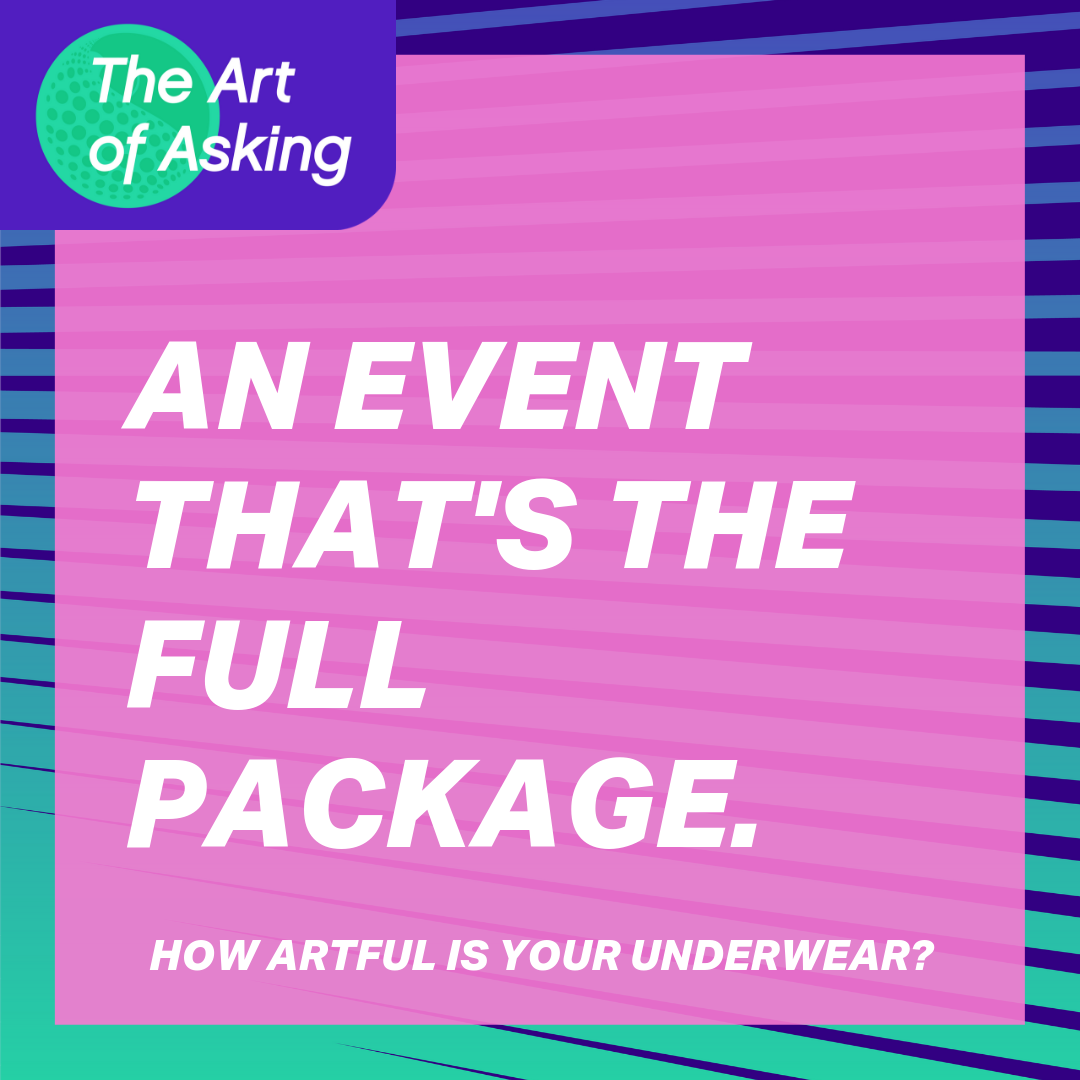
Whenever Spectrum Health Care created something for their Art of Asking event, an avant garde art showing with the intent to raise awareness for STI testing, they could reference this board to make sure they were on track and on-brand. With a simple glance, they are reminded exactly what logos, image styles, and textures they can use, and they know that anything else is off-limits.
Posters (above) and social media graphics (below) for Spectrum Health Care’s The Art of Asking event.
See how Spectrum uses the same brand elements to create a cohesive visual experience?
It’s vital to have consistency in your visual brand. When you consistently use the same brand assets, it becomes easy for your customers and the world at large to recognize your brand. You could even get to the point where you only need a simple image for people to recognize who you are. (Am I right, Apple?)
Get blueprints for business success.
Hoot Design Co. is a marketing, branding, and design agency located in Columbia, MO. We specialize in creating a custom and comprehensive marketing strategy centered around your business's unique strengths and educating you with the tools you need from day one. From logo design to brand identity, website design and execution, and social media marketing strategies in-person and through online courses, we're focused on your business success every step of the way.


