How to Brand a Website in 7 Steps
Ahh, the Internet. What did we ever do without it? We honestly have no idea.
One thing we do know, however, is that your online presence will make or break your client base. There's heavy competition out there in nearly every market – especially when you factor in the vast wealth of online competition, which you absolutely need to be doing.
Having a cohesive brand identity online is a huge boost to your credibility in the eyes of a consumer.
And your website better be modern, functional, responsive, and sleek if you want to make a positive impression. Don't believe us? Don't worry, we'll have you convinced soon enough.
Alright, that's enough poking fun at '90s computer tech. Down to business: Functional, modern branding integrated across your online presence will make or break a consumer's purchasing decision. And viewers make judgements very quickly – in under 50 milliseconds according to multiple studies (that's faster than the blink of an eye). Dysfunctional, dated websites are a huge turn-off to consumers across the board who make these split-second decisions. Even if you know you're the best at what you do (and would be the best option for a consumer to choose) you've got to prove it to them online before they decide to do business with you at all.
Here's an exercise:
Sorry, we can't resist more '90s internet action.
Go compare the 1996-licious Dole-Kemp campaign website to any of the 2020 hopefuls' sites – like Bernie. Now pretend you know nothing of the political issues or politicians' stances and Dole-Kemp has time-warped to the present day to enter the race. You're visiting the sites to meet the candidates and check out their backgrounds. Would you consider D-K competent? With the times? Capable of running the country in this decade? Reliable, trustworthy? Yeah, no way.
Awesome coffee GIF circa 1996 from the Dole-Kemp campaign website.
It's the same story with your business.
Your online presence is how your customer base is going to access information about you – even if they're just looking up a menu – and you've gotta nail that first impression.
So here's how to do achieve that seamless presence.
In 7 steps.
Ready?
1. Have a brand
We've gotta give this disclaimer first: You won't be able to have an awesomely relevant website unless you have an awesomely relevant brand. Until you've got all brand guidelines absolutely solidified, don't start trying to brand your site!
2. Make sure your web template is responsive
We love you, Pew Research Center statistics.
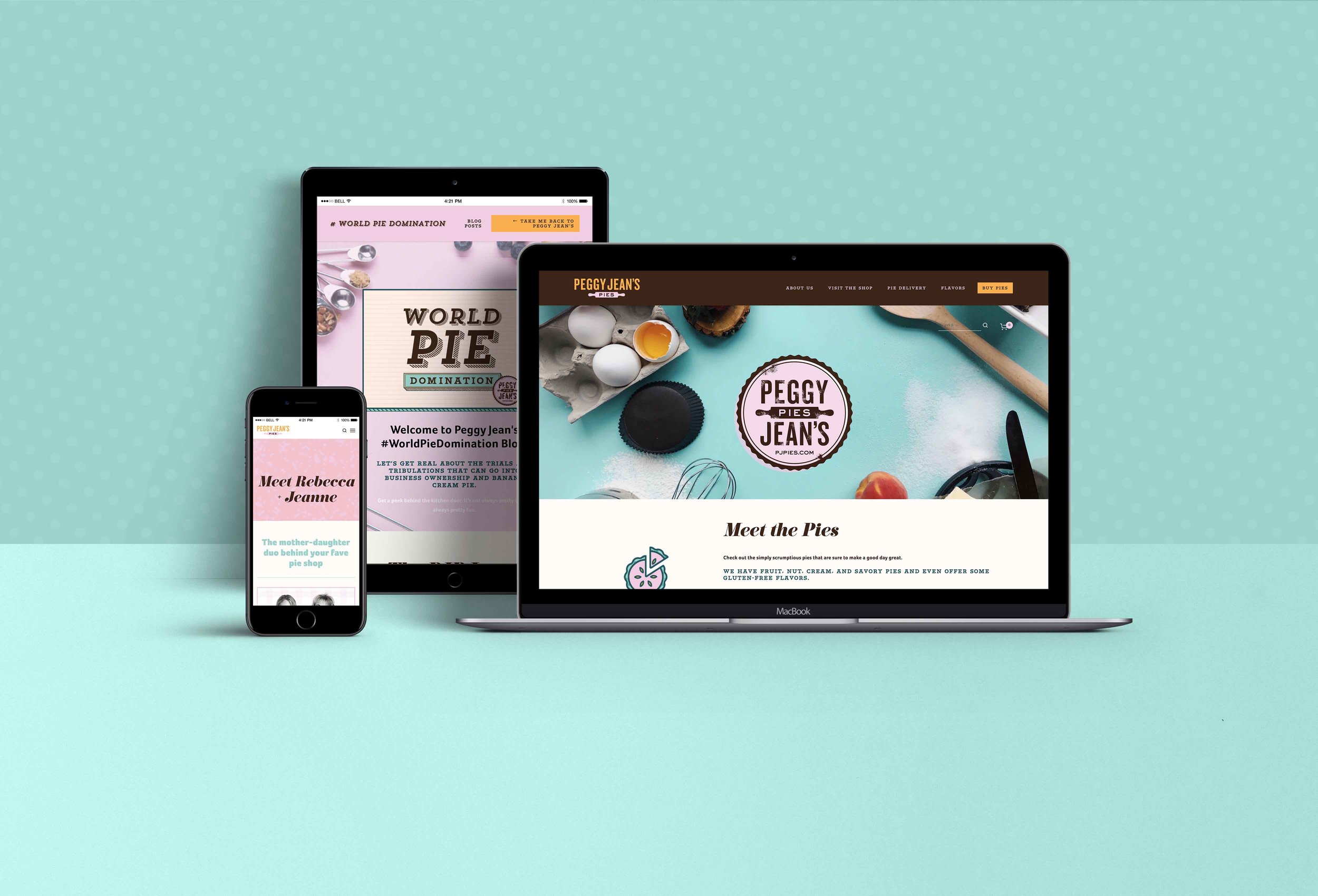
A responsive website scales seamlessly across any size screen – so you get an easy-to-navigate experience whether you're accessing the site on a desktop, laptop, tablet, or smartphone. 64% of all Americans own a smartphone (and that's including children in the population count. Among adults, smartphone ownership is at a full 90%). And one in five American adults have either no internet access or very limited internet access apart from their smartphone. So when those adults are viewing your site, they're checking you out on their phones.
If you're ignoring your site's mobile performance, you're cutting off customers. And decreasing your brand's credibility by giving the impression that you're outdated – just like the Dole-Kemp site.
Remember: a brand is a feeling associated with your company, not just a collection of visual guidelines! It's all about establishing that positive connection.
Pro tip: Fully responsive design is one reason we love Squarespace. All Squarespace sites are responsive from the get-go – allowing you to focus on your design and content rather than worry about adaptive performance.
3. Utilize consistent colors and textures
Having a brand counts for nothing if you're not using it! Far too often new brand owners fail to maintain the integrity of their brand – and experimenting with off-brand colors is a huge culprit here. [Related: Check out our post on the top 3 ways brand owners damage their brands for more info.]
But when you stay on-brand with all colors and textures, the result is a strong website with coherent branding. And on-brand texture and pattern can take a website from meh to mesmerizing.
Pro tip: Use a style guide service like Frontify, Canva for Work, or an awesome Pinterest hack to make sure you have super accessible brand elements and color swatches. Even better: come hire us and we'll not only make you a stellar brand identity, you'll get access to one of our custom-made brand Home Base pages so you can get the brand information you need when you need it, no matter where you are.
4. Integrate brand fonts throughout your site
This is another aspect of maintaining brand consistency. Especially if you're working with a pre-built theme, the default fonts aren't going to cut it! Typography is extremely important to consistent branding, and using brand fonts is essential to the cohesiveness of your website. Additionally, using multiple brand fonts throughout your site is a great way to demonstrate your commitment to your audience.
Why? Because a balanced mix of font styles allows readers to quickly interpret content. When you use different typefaces, weights, colors, and sizes to visually break your text down, you allow readers to group your content into helpful pieces. There are some great psychological principles at work here – our brains crave the ability to sort information into understandable groups – and demonstrating this attentiveness to your readers' desires boosts your credibility.
Nice balance, Wired. 😊
A great example of a site using this technique very well is Wired's website. The screenshot at right is taken from the site's main page – where Wired balances a total of four brand typefaces (though it's more common for brands to max at 3). The mix allows readers to quickly categorize the information they're taking in because Wired's design clearly differentiates headings, labels, titles, and dates with dynamic font choices. A+!
Pro tip: Any designer should be integrating readable fonts that are appropriate for paragraphs of text into your brand. If somehow your brand consists of only Curlz MT and Zapfino, that is NOT COOL. Get in contact with a brand doctor right away and fix that mess. You want your audience to be able to easily read your content – not get a headache and close the tab.
5. Display your brand elements in consistent locations
We're talking logos, icons, sub-logos – all identity indicators need to be displayed consistently throughout your site. Your primary logo iteration needs to be visible on every page in the same location.
The reason? Beyond showing off your great design choice, this consistency generates trust in your users' minds. Your company becomes more credible just by being consistent – take advantage of that opportunity! Check out some of Usability.gov's research on the importance of clear brand display for users' experience for more in-depth info!
6. Create a coherent look for photos
Food blogs, like Two Red Bowls, are great examples of creating a consistent look for photos.
Photography guidelines are often part of a complete branding package. Utilizing those guidelines in order to stay on-brand throughout your website helps unify your users' experience and will reinforce your brand values.
Especially – but not only – if you're selling products, consistent, high-quality photography lends you major credibility in the eyes of a consumer who's considering doing business with you.
Pro tip: Photo treatments are a great way to create a coherent look for images. We used this technique when we created Patriot Co.'s website because the original project photographs had a wide range of lighting and appearance. If you are really struggling with color balance, consider using black and white photography, which can be a powerful unifier.
7. Write in your brand voice
Your brand's voice is the way your company interacts verbally with your audience – as if it were an actual person. If your brand is fun and energetic, your copy should be fun and energetic throughout your site. But if your brand is high-class and sleek, your words should also be high-class and sleek. Brand voice can be a tricky element for small companies to figure out, but it's entirely within your reach and takes your brand up a notch.
Slack is a great example of a company that nails brand voice.
Pro tip: We created an in-depth look at two companies that nail brand voice and strategies that you can steal from them. Go check it out for tips!
Ta-da! That's it! Ready to conquer your website?
If you're a DIY baller, go out there and nail it! If you'd rather hand it off to the pros, you know how to get in contact with us.
Is there something we missed? Let me know! You can leave us feedback below.
Comment here or on Facebook with topics or questions you'd like to see us cover. Or maybe just links to your favorite GIFS. You can also follow us on Insta (where we've been named one of the top 8 Instagrammers to follow for career advice!), and come check out our Pinterest boards.


